_edited_edited.jpg)
PlutoPay
Case Study: Responsive Web App for Mobile Payment
Role: UX/Product Designer
Duration: August 2021-February 2022
Tools: Figma, Adobe XD
PlutoPay allows users to make payments globally and transfer money safely and securely without the hassle of carrying around multiple debit and credit cards. Customers will be able to do this efficiently and with ease of mind.
PROJECT BRIEF
Problem Context
Individuals aim to live a more simplified life. This includes the way they get, spend, and send their money. Users need a way to feel safe, efficient and secure when transferring funds online all while having it stored into one universal account they are able to trust.
The Solution
PlutoPay will provide users with one secure financial platform so that they can perform secured and hassle free purchases, payments and transfers.
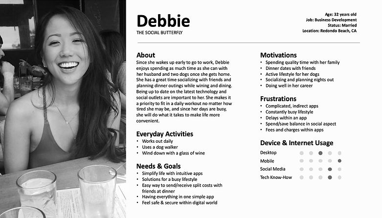
USER PERSONA
User Needs & Goals
Three individual user personas were created to portray the needs and wants of potential users. Based off the collection of data, it was determined that users had common needs and goals within a mobile payment app: to safely transfer money in a quick and seamless way. By recognizing this, key features needed to be present within the PlutoPay app.


USER STORIES & USER FLOW
User Stories
User Story 1
As a new user, I want to be safely send and request money, so that I know that my funds are secure. I need to have trust with the application.
User Story 2
It would be convenient to have quick balance transfers, so that I do not have to wait days for my funds to come in.
User Story 3
As a frequent user, I want to be able to add banks accounts and credits in one place so that it is like a one-stop shop for all my banking needs.
User Flow
A user flow diagram outlines the necessary steps to accomplish certain tasks. These tasks have been created based on the users' needs. It is important to recognize, understand and layout the navigational path that is needed for users to complete tasks.

WIREFRAMING
Low-Fidelity Wireframes
Low-fidelity wireframes were illustrated to represent the screens within the app as well as the flow of completing certain tasks. Displayed below are some of the screens found in the PlutoPay Payment App.

Mid-Fidelity Wireframes
For the ease of use, details are simple yet fully display the users' needs and goals. Once user feedback was collected from low-fidelity wireframes, mid-fidelity wireframes were created for the main features within the app.


Usability Testing
Usability Tests were performed on six participants in my personal network that are familiar with payment apps and fall in within the target audience. The main focus is to observe and evaluate the users' interactions, body language, facial expressions, and usability while performing given tasks: sending money, adding a new credit card, filtering to a past transaction.

Style Guide
PlutoPay's design language consists of a style guide that consists of visual elements, icons, headings, fonts and sizes, etc. to provide consistency throughout the app.

Solution Defined


HOME SCREEN
Effortlessly Access Features
With a simple and straightforward dashboard, you can quickly transfer your funds or send someone money through the enlarged buttons that make it so easy that you'll be done quicker than you know it.
ADD A CARD
Input Info in a Snap
No one enjoys carrying around a hefty wallet full of debit and credit cards. Store all your cards in one safe place. Make it even easier by inputting your card information or better yet, take two quick snaps with the camera and voila! Your card is now in your account, secure and ready to use.


SEND MONEY
As Easy as 1, 2, 3!
Paying the plumber that just fixed your kitchen sink? Splitting a dinner bill and your friends need to pay you back? Put away your checks and no need to rush to the ATM. You can also choose to use PlutoPay's QR code to scan and pay. PlutoPay makes sending and receiving money simple, fast and efficient.
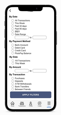
FILTER HISTORY
Browse Old Transactions
When your friend is asking how much you spent on last year's concert tickets but you can't recall... look no further. PlutoPay is here to help! Set you filters, apply, and boom... your spending history is available right in front of you. No more keeping old receipts and checkbooks!
Challenges & Takeaways
As my first experience working with the design process of UX/UI design, I came across several hurdles while developing PlutoPay. The most challenging of all was dissecting and fully understanding users' needs, wants and goals in an emotional sense and portraying them within the app.
While dealing with money can be stressful and overwhelming, I wanted to give a warm, friendly and welcoming design that caters to the target audience.
Working on PlutoPay has given me the opportunity understand the process of design and not be too affected by negative feedback and criticism. Times are always changing, and trends come and go. However, it is crucial to stay up to date with what is relevant and be willing to constantly make changes. By doing so, it will only help me in becoming a better designer and provide products that enhance user experiences.
I look forward to many more iterations, challenges, and accomplishments, as well as the future for PlutoPay.